The OEOP becomes MITES
Why rebrand?
The OEOP, now known as MITES, was in need of a new website that more effectively communicated the who, what, where, when, and why of our work. We have adopted a more succinct, connected, and streamlined brand for our organization to help students, families, prospective staff, and donors understand who we are and what we do. Our new brand and site are more effective and engaging to help grow and sustain our programs and execute our mission and vision to make science and engineering careers more accessible to all.
Ultimately, through this new look and feel we want to promote the quality, reputation, and value of the transformative opportunities we offer for all of our scholars, no matter which program one participates in.
- Increase participation in all programs and strengthen community and alumni network
- Make our identity more coherent by reducing complexity and confusion about who we are and what we do
- Better leverage limited resources for fundraising, marketing, branding, and communications by streamlining our current brands, strengthening connection to MIT, sharing one unified story around mission, need, and impact
- Attract a greater number of talented scholars from underserved and underrepresented communities by more intentionally sharing stories that celebrate our student and alumni experiences, especially bolstering shared experiences of impact across different programs
- Promote the quality, reputation, and value of the transformative opportunities we offer to all our scholars, across all programs
- Belong to a bigger community of peers who understand the journey
- Opportunity to find a MITES friend is 2x higher!
- Capitalize on the MIT brand when speaking about the experience
- Have an easy-to-understand and historic name to describe program to universities and future employers
New messaging and look
Previously, the OEOP was managing 7 different brands under one mission. Now, MITES’ messaging is clearer, more compelling, and self explanatory. For our new logo, we are leveraging 46+ years of history and reputation, we are pulling forward shapes, colors, and names of other programs that have run through our office. The shapes are intentionally interwoven within our logo’s letterforms to highlight the strongly connected and supportive community that we foster.
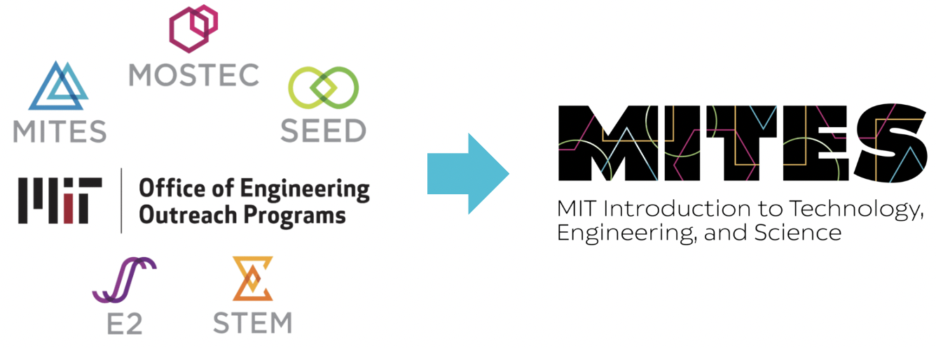
Overall, the combination of shapes, colors, and letterforms in this logo builds on concepts of diversity, togetherness, and connection while welcoming future growth and change. It shows that together we are one, inclusive, diverse, empowering MITES.And on the more practical side, we now only need to manage two brands, MITES and MIT.
The typeface we chose is bold (just like our endeavors), welcoming, and uniquely quirky. The updated colors reflect the richness and vibrancy of our community and add movement, dynamism, and fun to the mark. Our logo is especially powerful when used with a black background, as it alludes to the social justice nature of our work. And we have the option to use a white background for materials that could benefit from that variation.
New program names
SEED Academy becomes MITES Saturdays
Multi-year STEM academy for 7th–12th graders in Boston, Cambridge, and Lawrence, MA public schools
MITES SaturdaysMOSTEC becomes MITES Semester
Six-month hybrid STEM experience for rising high school seniors, June–December
MITES Semester
MITES becomes MITES Summer
Six-week residential STEM experience for rising high school seniors
MITES Summer